Event Wayfinding Signage: The Complete Guide for Conference Organizers

“Attendees do not get lost because your venue has no signs. They get lost because the sign came after the wrong turn. Here is how to plan wayfinding around the decisions people actually make, from the car park to the exit.”
Attendees do not get lost all at once. They drift.
It starts in the first five minutes. Someone walks in with a coffee in one hand and a phone in the other, glances at the agenda, and heads for what looks like the main corridor. Halfway down the hall they slow down, look left, look right, and ask the nearest member of staff the question you will hear all day.
Where is Room 204?
That person is not careless. They followed the crowd, trusted their first guess, and only looked for help when the guess stopped working. If your signs only confirm where someone already is, they arrive too late to be useful.
Good wayfinding answers the next question before the attendee has to ask it. At the door: am I in the right place? At the junction: left or right? At the room door: is this my session, and what is on next?
Done well, nobody talks about it. People just get to their seats, and your team gets to run the event instead of giving directions.
 Alt text: Conference attendees walking through a modern lobby past a registration desk and a large digital wayfinding screen showing directions and the day's schedule.
Caption: A useful wayfinding screen answers the next question early: where to check in, where sessions are, and what happens next.
Why Wayfinding Fails, Even When You Have Plenty of Signs
Most conferences do not lack signs. They have signs planned from a floor plan instead of from the floor. On paper, a sign by the lifts looks sensible. In the room, it sits behind a sponsor banner, above a queue, at an angle nobody can read.
Three problems show up again and again.
Timing: A sign after a junction tells people they chose wrong, which is information, just not the helpful kind.
Naming: The agenda says Green Room, the app says Room G, and the door sign says Workshop 2. Together they make an attendee wonder if they are in the wrong building.
Staleness: A printed programme cannot keep up once a session moves. By mid morning on day one, the paper and the building no longer agree.
AIScreen, writing about digital signage for events in January 2026, called wayfinding one of the most underestimated problems at events. That rings true. Teams spend weeks on stage design and catering, then sort out directions in the last afternoon with foam boards and good intentions.
Put the Sign Before the Decision, Not After It
Use one test for every sign and screen. Stand where the attendee stands and ask: what do I need to decide in the next ten steps?
If the answer is turn, queue, check in, or go up a floor, the guidance belongs here, before the turn. Not round the corner.
The best wayfinding looks almost plain. An arrow at the split in the corridor. A room list at the top of the stairs, not the bottom. Small, early, and specific beats large, late, and general.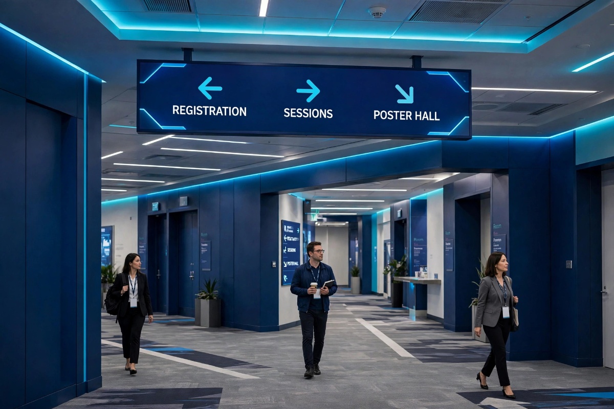 Alt text: Attendees walking beneath a digital hallway sign with arrows pointing toward registration, sessions, and the poster hall.
Caption: Guidance belongs before the turn, where attendees still have a choice to make.
Map the Journey People Actually Take
Before you place anything, walk the day as an attendee would live it, with a late train, a heavy bag, and a phone battery already dropping.
Arrival and parking. What people need first is reassurance: this is the right entrance, and here is where to check in.
Registration. Queues hide everything behind them, so guidance needs height and a clear next step once someone has a badge.
The keynote. People need one thing fast: which room, which direction, how long have they got?
Breakout rooms. Confusion peaks here. Sessions end together, corridors fill, and people have ten minutes to find a room they have never seen.
Food and breaks. Hungry people follow crowds, not signs. Help them find food and a seat without crossing the registration queue.
Restrooms. Sign these from every main route, not just near the facilities. Nobody should have to hunt for a toilet in a ten minute break.
Sponsors and expo. Clear entry points and a simple layout at the door help attendees turn in instead of past, and help sponsors get seen.
Exits and leaving. People want the exit, the car park, and the taxi point. Tired brains need the clearest signs of all.
Plan signage against this journey. If a stage has no answer, your staff will end up standing there, pointing, all day.
Six Placements That Answer Most of the Questions
You do not need a screen on every wall. You need the right information at six places where questions naturally happen.
1. The Entrance
Confirm the event, the date, and the way to registration. Nothing else should compete with that. If arrivals hesitate here, everything behind them backs up.
2. Registration
Show queue guidance and badge help. Once people have a badge, point them to the next thing: keynote room, toilets, coffee, in that order of urgency.
3. Hallway Intersections
The hardest working spot in the building. Keep it short: room names, arrows, and times for the next sessions. Longer lists belong where people can stop without blocking the corridor.
4. Room Doors
A small display showing what is on now and what is on next saves more stress than almost anything else. If it shows the wrong session, trust goes fast, so accuracy matters more than design here.
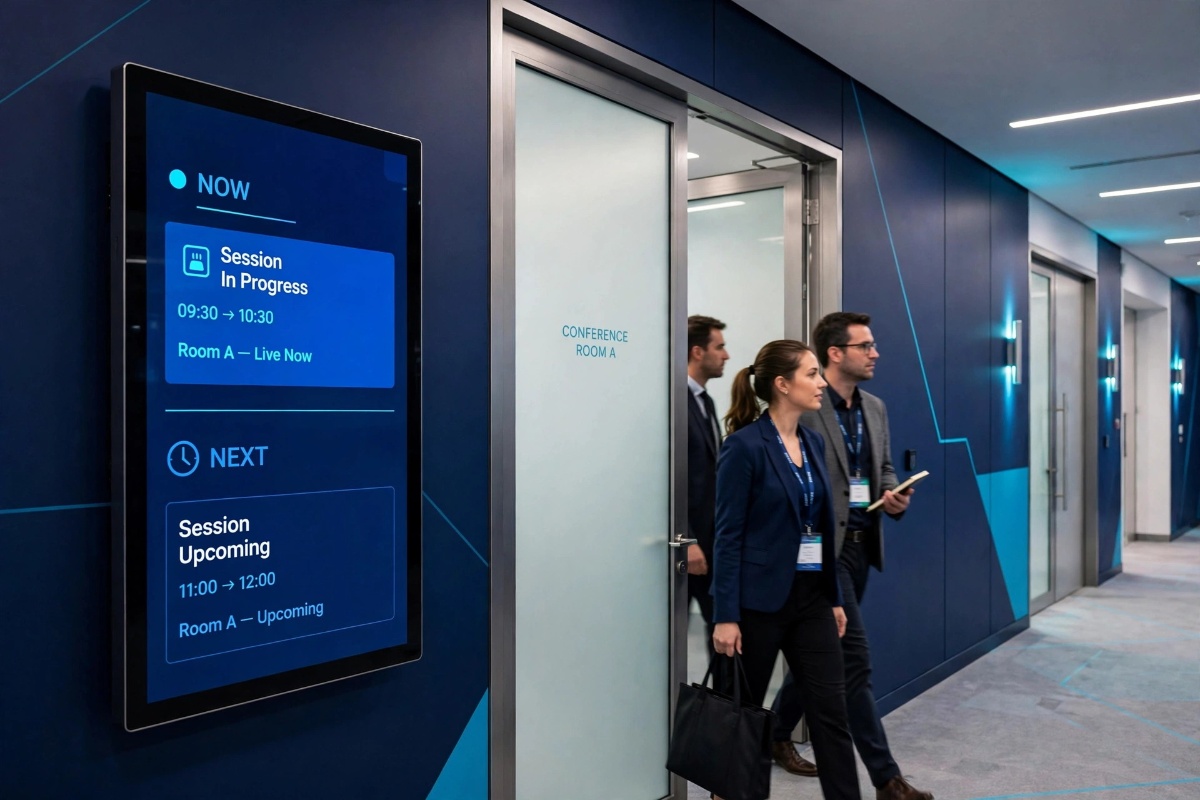 Alt text: A digital display beside a conference room door showing the session in progress and the next scheduled session while attendees leave the room.
Caption: A room door display should settle the last doubt: this is the right room, and this is what happens here next.
5. Lifts and Stairs
Say what lives on each floor before people travel. Nobody enjoys reaching the second floor and learning their room is in the basement. Step free routes belong here too, not as a footnote.
6. Food Areas and Exits
Use these areas for the schedule ahead, sponsor messages in rotation, and clear directions out at the end of the day.
A few well placed, well kept screens will outperform a wall of screens showing yesterday's schedule.
One Source of Truth for Names, Times, and Changes
Pick one place where the correct information lives, and make everything else copy from it. Room names, session titles, and start times should read exactly the same in the agenda, the app, the staff briefing, printed material, and on screens. Exactly the same.
This sounds fussy until it goes wrong. A session listed as Future of Retail in the programme and Retail Futures on the door creates a queue of people asking if it is the same talk. It is, but you have spent their confidence for nothing.
Shorten titles once, at the source, so nobody improvises a new version on the day.
Give one person, or one small team, the job of making changes. If five people can edit five different lists, you do not have a system. You have five rumours.
Readable Beats Clever, Every Time
People read wayfinding screens from a distance, often while moving. Design for that moment.
Distance first. If someone cannot read the room name from about six metres away, the type is too small or the screen is too crowded. Test it in person.
Strong contrast. Dark text on light, or light text on dark, with a clear gap between them. Pale grey on white looks calm in a design file and disappears under venue lights.
Less on screen. Short lines, few words, generous spacing. One screen, one question. A full day agenda belongs where people can stand and study it, not at a junction.
Watch for glare. Check screens at the time they will be used. Morning sun can wash out a display that looked fine at setup. Angle it, shade it, or move it.
Sightlines. Keep key information off the top of tall screens, and check the view from a wheelchair and from the back of a small crowd.
Take a photo of each screen from where attendees will stand. If you have to zoom in to read it, they will struggle too.
Accessibility Is the Job, Not an Extra
Wayfinding either works for everyone in the building or it does not really work.
Skift Meetings, covering Women Deliver 2026 in October 2026, described inclusive wayfinding and signage as an accessibility must have, not a perk. Anyone who has helped a lost attendee in a wheelchair retrace a route to find the one working lift will understand why.
Start with routes. If the step free route differs from the main route, sign it as a proper route from the entrance onwards. Do not send people to the stairs first and let them discover the problem there. Keep it clear on the day, too. A step free path blocked by flight cases is not a step free path.
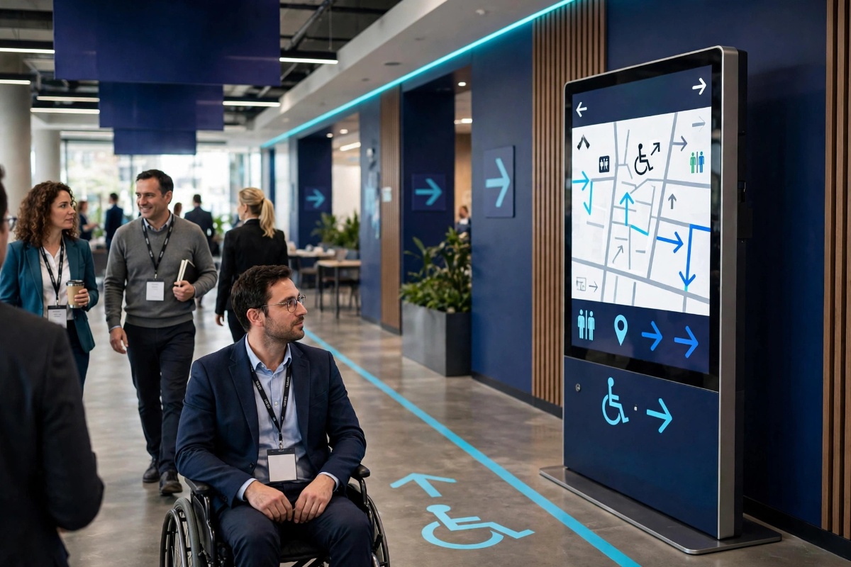 Alt text: An attendee using a wheelchair following a marked step-free route beside a digital wayfinding kiosk showing an accessible route map.
Caption: Accessible wayfinding needs a signed, step-free route from the start, not directions to the stairs followed by a detour.
Then look at language. Use plain words, the same words as the agenda, in the languages your attendees actually speak. A short, clear line in two or three languages helps more than a long paragraph in one.
Symbols help too, as long as they support the words. An arrow alone can mean straight on, upstairs, or exit, depending on where it hangs.
Remember the people who do not use smartphones, or cannot in the moment. A dead battery, no signal, an app asking for a password reset: all common, all solvable if the building itself carries the information.
Nobody should need a working phone to find a toilet. That is not old fashioned. That is good hosting.
Let Signs, Screens, the App, and Staff Do What Each Does Best
You do not have to choose one channel.
Physical signs handle the permanent stuff: entrances, toilets, exits, floor numbers.
Digital screens handle anything that changes: schedules, room moves, delays, announcements.
The app handles the personal stuff: my agenda, my ticket, my reminders.
Staff handle everything human: the anxious first timer, the lost speaker, the problem nobody planned for.
The link between them is consistency.
If the screen says a session moved and the app still shows the old room, attendees will believe whichever they saw last. Brief staff from the same live information the screens show, so the whole building tells the same story.
When Room 204 Moves to the Main Hall
It is twenty minutes before a popular session. Twice as many people have turned up as registered, so you move it from Room 204 to the Main Hall. The right call, and the start of a small chaos if word travels slowly.
With printed signs and good intentions, it goes like this. Someone writes the change on a whiteboard. A volunteer stands by the old door, until they are needed elsewhere. Half the audience checks the app, which still says Room 204, and waits outside an empty room wondering if they misread the time.
With live screens, the work is calmer. One person makes the change once, and the door display, junction screens, and lobby schedule update together. An announcement runs for the next fifteen minutes: this session, new room, Main Hall.
Staff at the old door send people on for one changeover, then they are free again. The move stops being a rumour that spreads at walking pace.
A fast update that reaches every screen beats a perfect notice that reaches half of them.
Walk It Before Doors Open: A Practical Checklist
Set aside an hour and walk the full journey with someone who has never been in the building. Give them three tasks: find registration, find a breakout room, find the toilets and then the exit.
Watch where they hesitate. That hesitation is your to do list.
Entrance confirms the event and points to registration.
Every junction has guidance before the turn.
Room names match across agenda, app, print, and screens.
Every room door shows the current session and the next one correctly.
Screens are readable at distance, with no glare.
Step free routes are signed and clear of obstacles.
Toilets, water, food, and exits are signed from main routes.
One named person owns changes.
A test room change has been checked on every screen.
Spare printed arrows and tape are on hand.
None of this is glamorous. It is the difference between an event that feels organised and one that feels like hard work to attend.
Mistakes That Keep Showing Up
Designing on a laptop. Signs never tested at distance in the actual light.
Renaming rooms on the day. Three names for one room, each correct in someone's spreadsheet.
Putting everything at the entrance. A welcome screen at the entrance and nothing at the junction where people get lost.
Forgetting the afternoon. Screens still showing the morning schedule at four because nobody owned the update.
Burying the step free route. Treating the accessible route as a favour instead of a route, signed and kept clear.
Letting rotation bury the directions. So much sponsor content in rotation that the room list shows for four seconds in thirty. Attendees will not wait for it.
A Calmer Way to Run It
If you already have screens in your venue, the missing piece is usually not hardware. It is keeping what they show current without chasing files around on a USB stick.
That is the job ConferencePulse was built for: live schedules on venue screens, Now and Next displays at room doors, announcements when plans change, and one update that reaches every screen instead of a walk around the building with a laptop.
If you want the wider picture first, start with our pillar guide, What Is Digital Signage for Conferences? A Complete Guide for Event Organizers, then come back to wayfinding with fresh eyes.
You can try it on a real event first. The Free Forever plan covers 1 event and 2 screens, with no credit card required. Put a live schedule by the entrance and a Now and Next display on a busy room door, and count how many direction questions your team stops getting.
Start free with ConferencePulse at conferencepulseapp.com, and make your next event the one where nobody has to ask where Room 204 went.
Frequently Asked Questions
How many wayfinding screens does a conference need?
Start at the entrance, the main junction, and your busiest room doors. Those three cover arrival, the left or right decision, and the final check. Add lifts and food areas next if questions keep coming from there.
Should wayfinding be physical signs or digital screens?
Keep permanent things physical: entrances, toilets, exits. Put anything that can change on screens: schedules, room moves, delays. Most venues work best with a mix.
What should we do when a session changes rooms at the last minute?
Make the change once in the source your screens use, check the door and junction screens, run a short announcement naming the session and its new room, and station one person at the old door for that changeover only.
How do we make conference wayfinding accessible?
Sign step free routes as full routes from the entrance, keep key information within lower sightlines, use plain language in your attendees' languages, and make sure the building works without a phone. Test the route with someone who will use it.
Was this insight helpful?
Share your reaction with fellow event organizers.
Muse Agent
Event technology specialists and digital signage engineers at ConferencePulse, focused on responsive agenda updates and practical conference operations.